Well howdy everyone! Last I left off, you knew of my plans to move to a different part of Virginia and it’s been radio silent since then. We’ve had a TON happening in the few weeks since the move and if there is one thing to confirm, it is that I have absolutely way too many things. I thought I did a pretty good job of downsizing but as it turns out, my move to Southern Virginia was the largest yet in my career and I was way over my allotted weight limit.

So aside from a bajillion boxes everywhere, I figured I’d post a few pictures of the new house and tell you all about my plans for it. I’m going to do this in two parts to prevent this post from becoming too lengthy so right now, Im going to focus on the first floor. My next post will show you everything for upstairs. And finally the third post will be for the outdoors spaces. Before I continue, I should warn you. The previous owner had an obsession for the color blue and literally EVERY room is a different shade of blue.
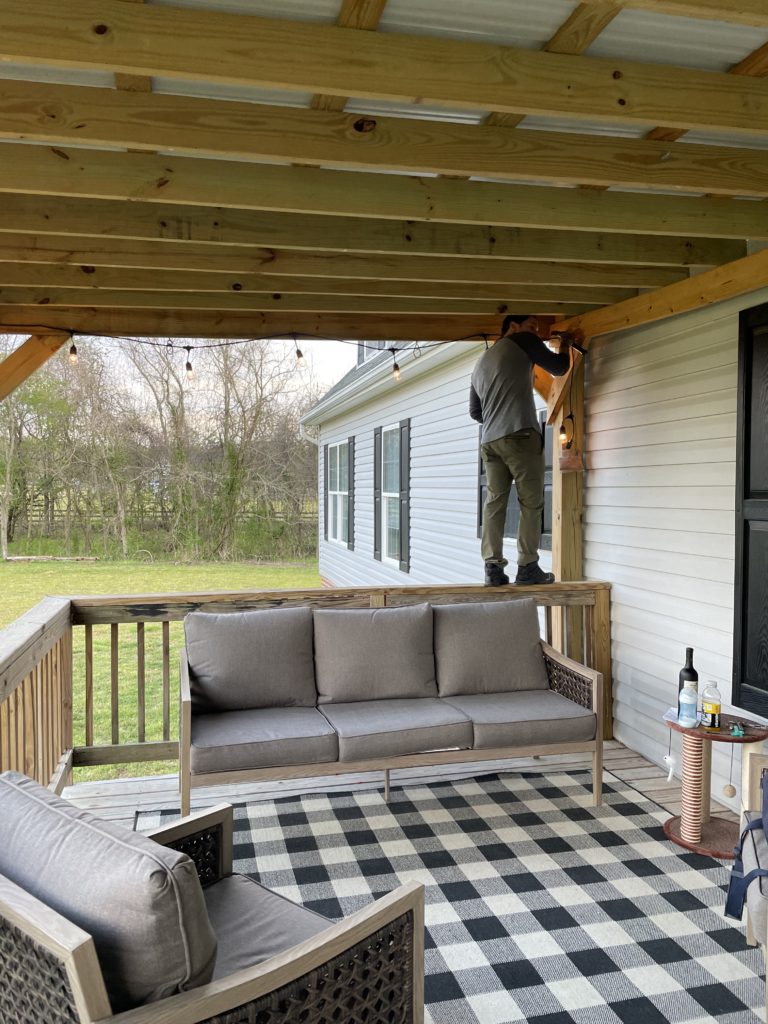
First, let’s start with the porch since it’s the first thing you see walking up to the house. Ignore the handsome man standing on the rail. He was hanging some edison bulb lights when I took this picture. It’s your standard deck and in decent shape. We started working on this area first because the weather is getting warmer and we wanted to have a nice area to hang out. For now we just dressed it up with a cute rug and some new outdoor furniture, but eventually, my plans are to paint the deck, the roof and extend the porch to wrap around the side and back (way down the line). For now, working on it bit by bit seems to be the plan.
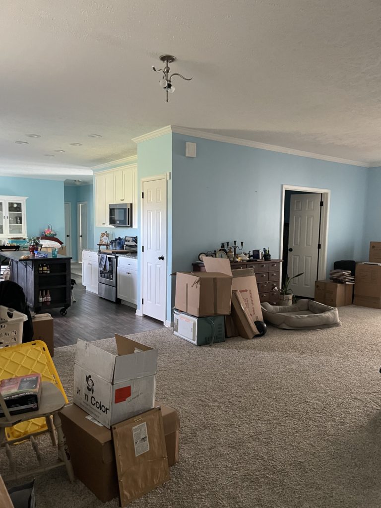
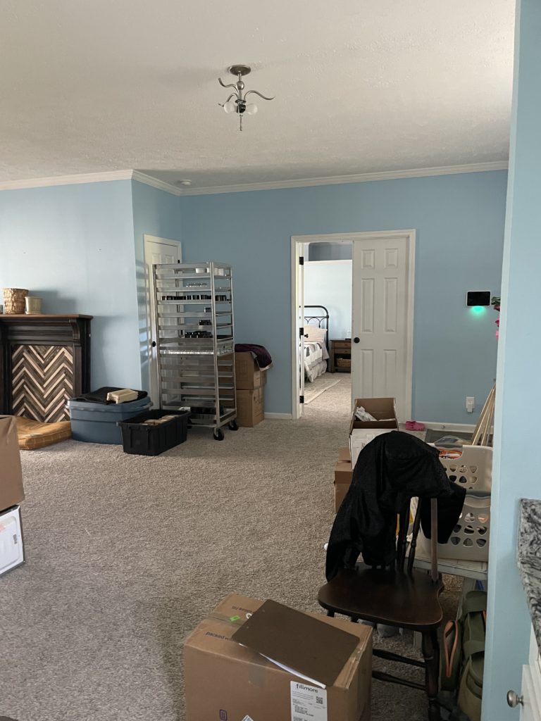
Next up is the awkwardly large entryway/foyer area. I don’t think this house has a well thought-out layout but we will make it a home regardless of it’s quirks. I’m sure you know the baby blue is going bye-bye so these walls will be light and bright eventually. All of my candle studio items are also being stored here for now until my candle studio gets delivered so it’s a bit disorganized. Our master bedroom is also right off the entry too which I don’t like but I’m working with a contractor to see about moving those doors eventually.
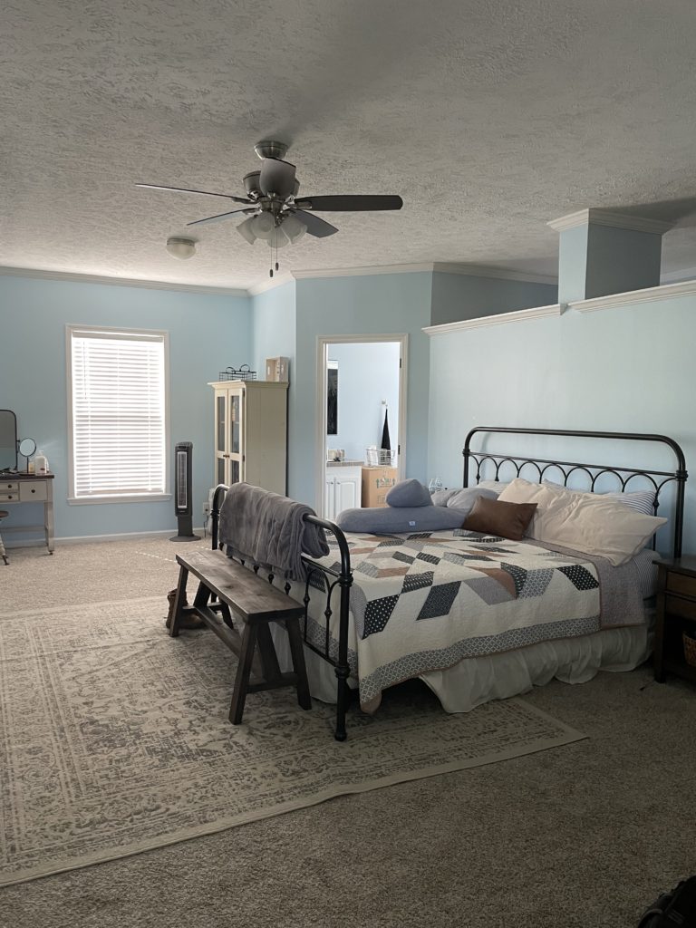
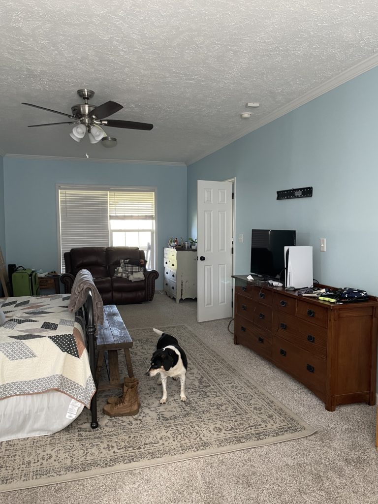
To the right in the master bedroom, you will notice MORE blue. Our first major plan is to obviously paint. We want to rip out the carpets (in the entire house) and install Luxury Vinyl Tile throughout. We also have two bathrooms, which is awesome in theory but with these two bathrooms we sacrifice alot of room in the bathrooms as well as in the closet area.
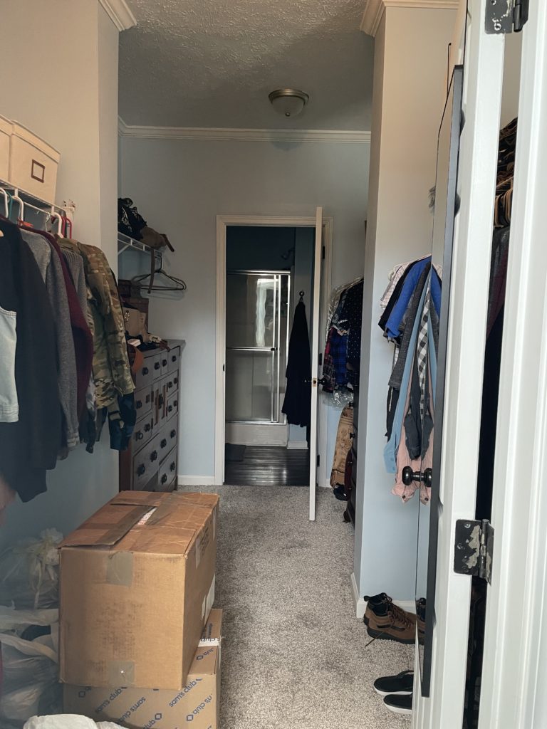
The closet is currently a “walk through” closet which means it is smack dab in between the bathrooms in that weird area that has an exposed overhead (right behind the bed). Our plan is to eliminate the two bathroom concept, and make one large bathroom and one large walk in closet. Right now we have the shower in one bathroom and the bathtub in the other which is terribly inconvenient since the larger vanity is in the bathroom with the tub.
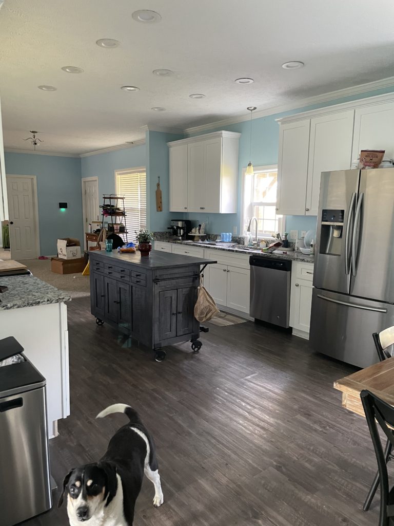
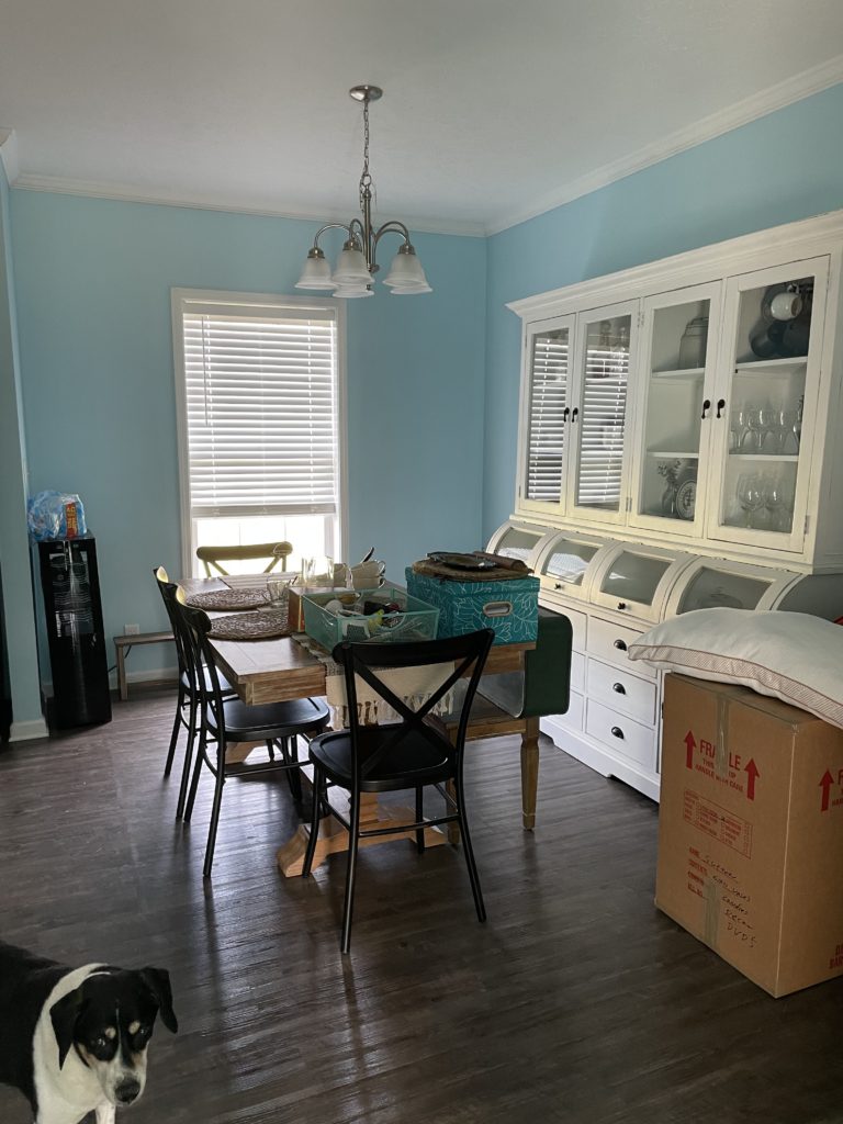
Once you exit the master bath you look straight on into the kitchen. The kitchen is okay. It’s not the worst kitchen and the appliances are fairly new. But it is smaller in terms of not having much room for storage, or a pantry, and Im not a huge fan of cooking on an electric range. The kitchen also opens up to the dining area which is relatively small. My plans are to conintue the LVT floors, shift the kitchen to the dining area and add a huge built in island. I want to retain that wall where the stove is to make a coffee/wine bar while adding more pantry storage. The wall where the sink is will become part of the dining room and we will grab some foyer space to make a large dining area. Im still undecided on cabinets color and design but the general layout of the kitchen changing is what Im looking forward to.
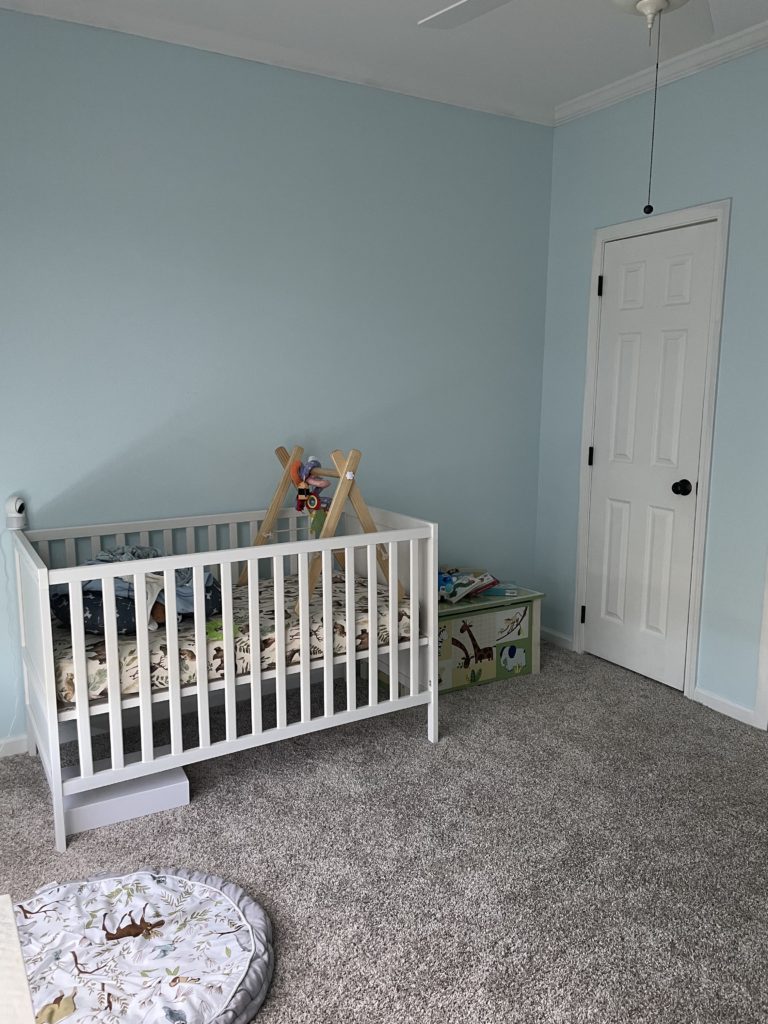
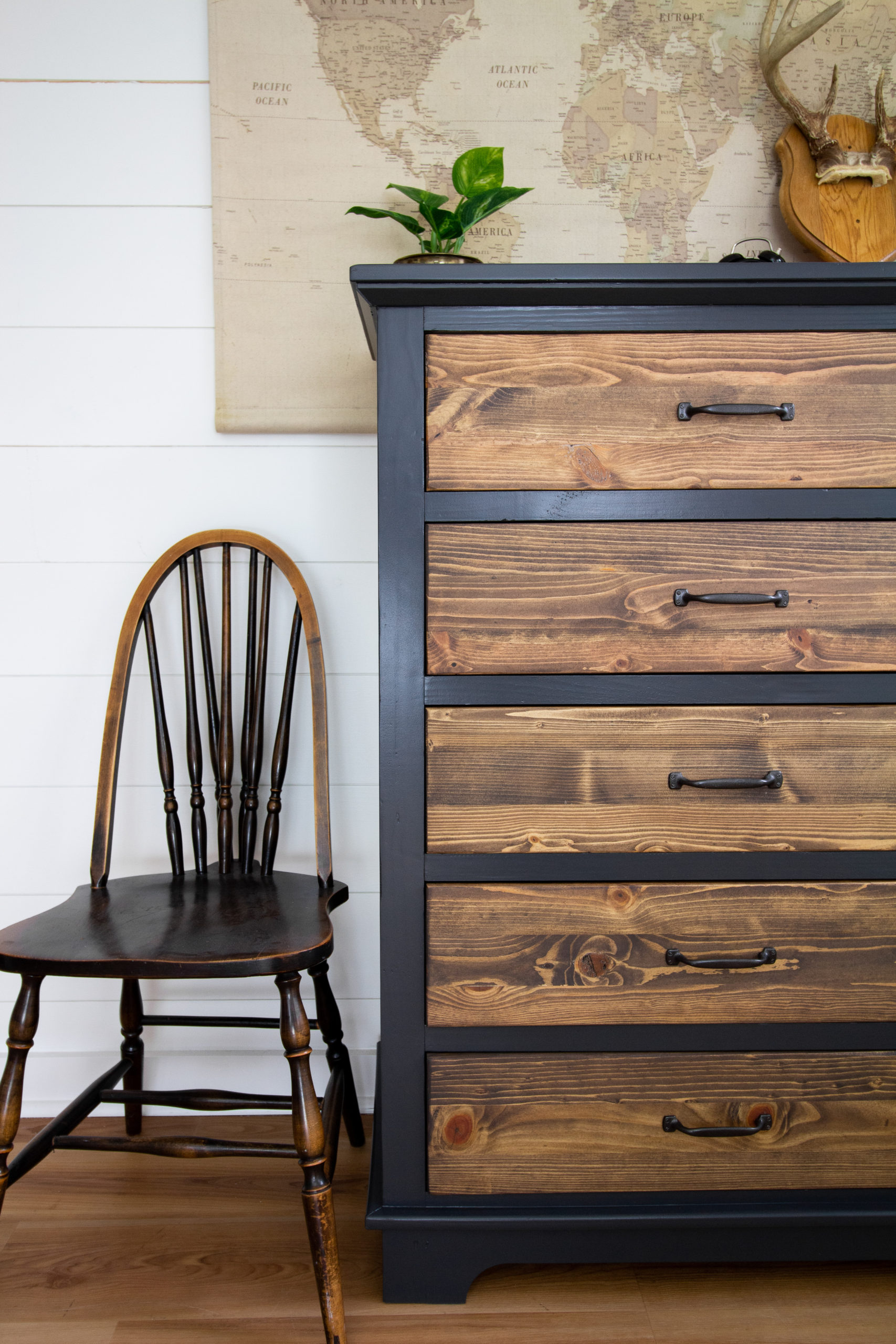
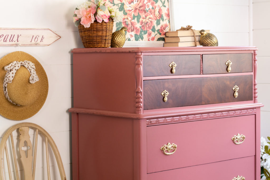
Directly behind the dining room wall is a bedroom which we are using for our 6-month old, Charlie Blue. His room is also…you guessed it a shade of Blue. We wanted to add some panelling or wall accent to his room, like beadboard or shiplap. The theme for his room is outdoors/adventure so we love earthy greens paired with mushroom taupes and whites. We will look at doing something more efficient for the closet rather than having two doors. We’re also going to dress his used IKEA dresser up with a cool design and add new floors and a rocking recliner. Other than that his room should be one of the easir ones to work on.
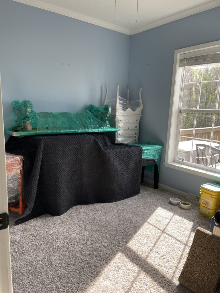
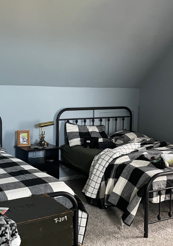
Across from Charlie’s room is another bedroom. We are using this to store my furniture pieces and for extra storage since we want the older kids upstairs as well as our guest bedroom. Not much will happen in this room other than new floors, fresh paint and a new light fixture.
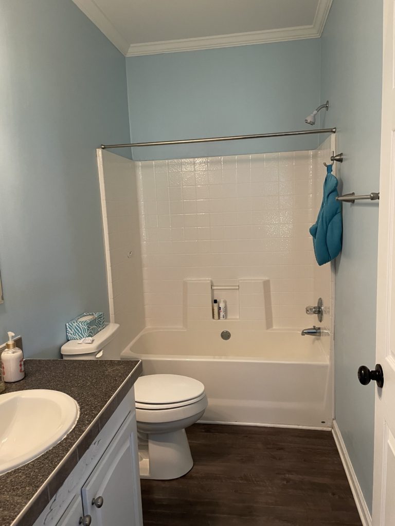
Next to this bedroom is a guest bathroom with a full shower and tub. This bathroom needs a ton of work. It will probably get completely gutted. We hope to add a window and an exhaust fan. We will add a new tub with a tile surround, new flooring and a new vanity and light fixture.
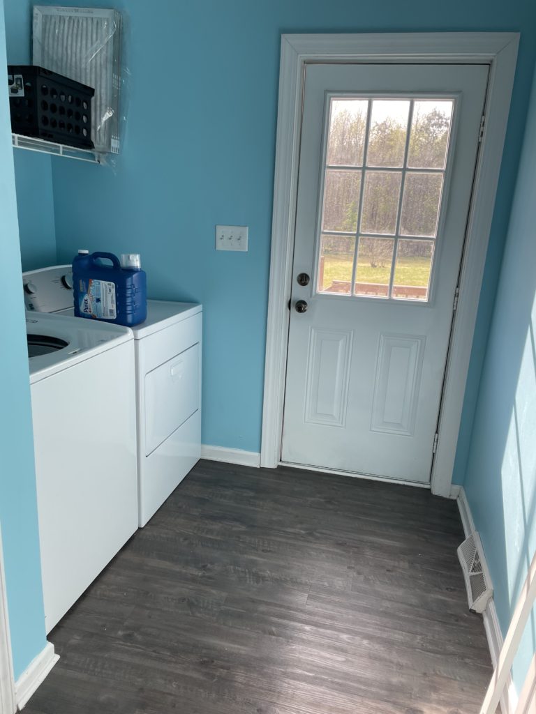
Next is the laundry room. Not much will happen in here other than adding some cabinets above the washer and dryer, new paint and flooring, and possibly painting the doors. We might add a counter later on so we have room and space to fold clothes but that would require getting front load washer and dryer.
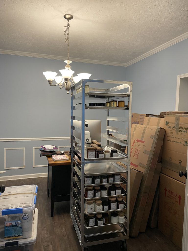
Right next to the laundry room is a fairly large space that is dubbed the formal dining room. I dont particularly like this room because it doesn’t have any natural light that flows through and is very dark. I have been using it as my office in the meantime, and the plan is obviously to find some way to bring in natural light, through french doors/transoms…I’d love to have a ton of built-in cabinet storage space for my files and supplies. My vintage and staging supplies are also being temporarily being store in here along with my packing station, so it actually looks smaller than it really is. New floors, new paint, tons of lighting and fancy doors should dress up this place pretty niceley.
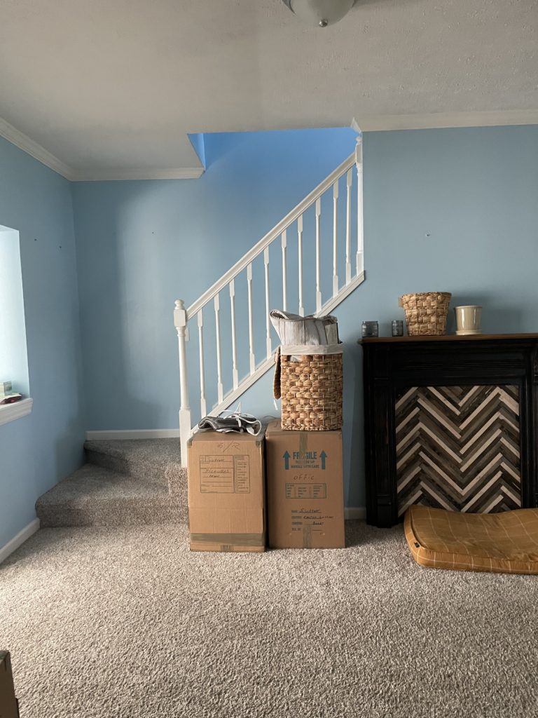
The office opens up to more weird entryway storage which I am also considering for an alternate dining space. The access to the stairway is in this area so I’d have to play around with it to see how I would like eating in this space. Otherwise, I have absolutely no idea what to do with this area.
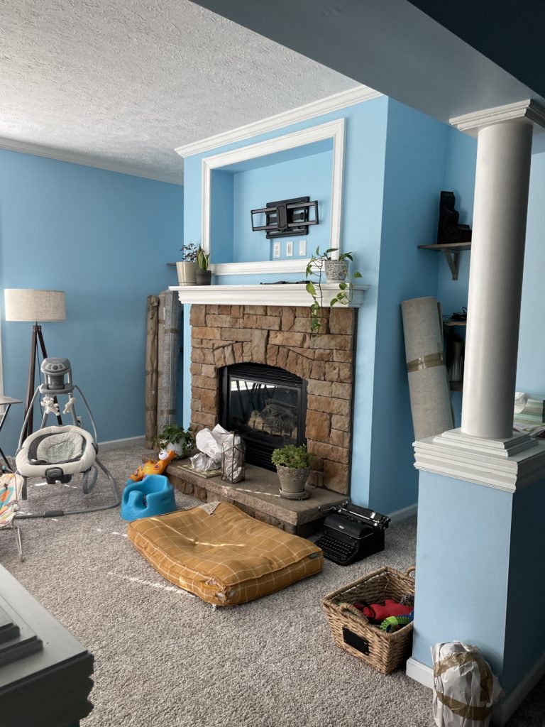
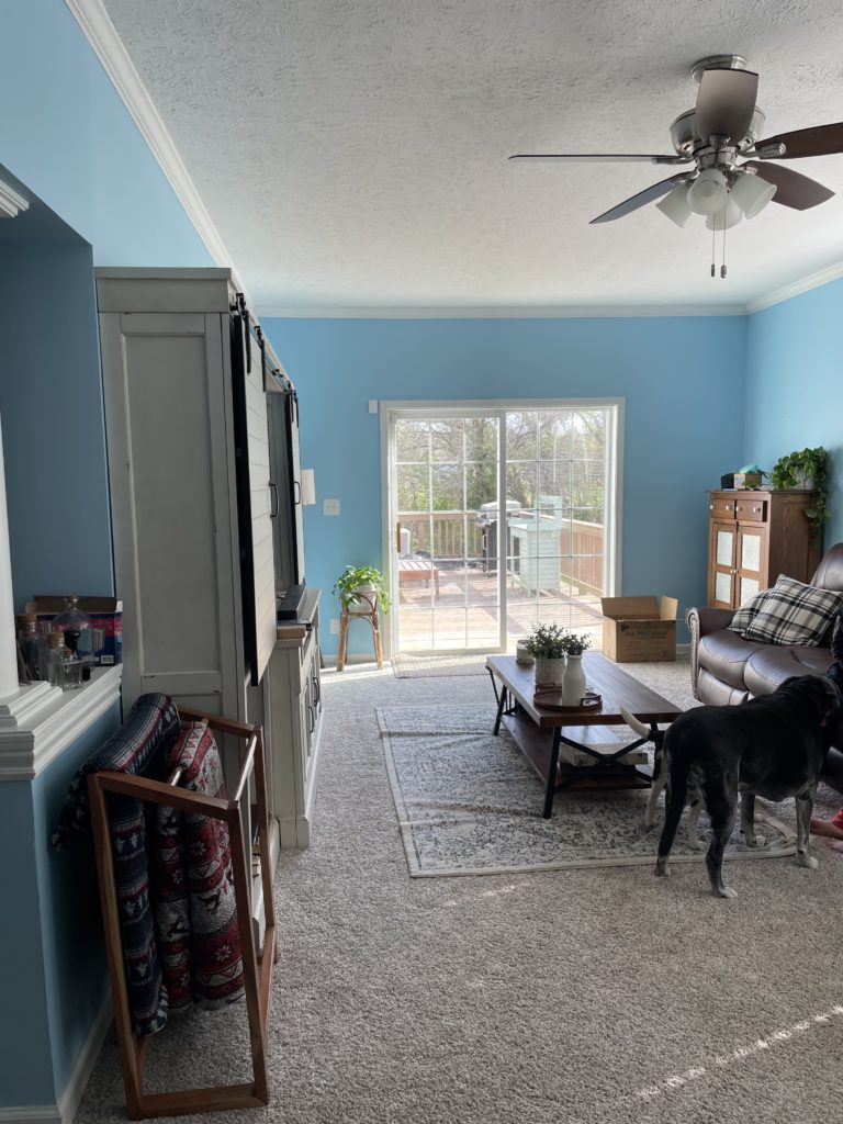
Lastly, the room with the pillars. I hate the pillars. But until we make a decision on possibly expanding this room, they are going to stay but I have a plan to wrap them with wood which might actually make a nice accent point for entry into this room. This room is our living room which compared to the size of the house is actually pretty small. I hate the fireplace and eventually that will get replaced with an electric insert. We will add classic brick or a fun tile for the surround, a wood mantle and some book cases for extra storage. I really love the look of vertical shiplap in family rooms so that’s what we will do in here as well as a wood plank cieling. The floors will also be upgraded which is a blessing with two dogs who love to shed.
Well there you have our long drawn out plans for the first level of the house. I anticipate it taking YEARS to get to the point where I want it but by then I’m sure some of the trendy stuff I’m loving will be “outdated.”
I would love to hear your thoughts and suggestions on how to make this more functional and stylish! Comment below!








Leave a Reply